
Prototype
User Testing Insights
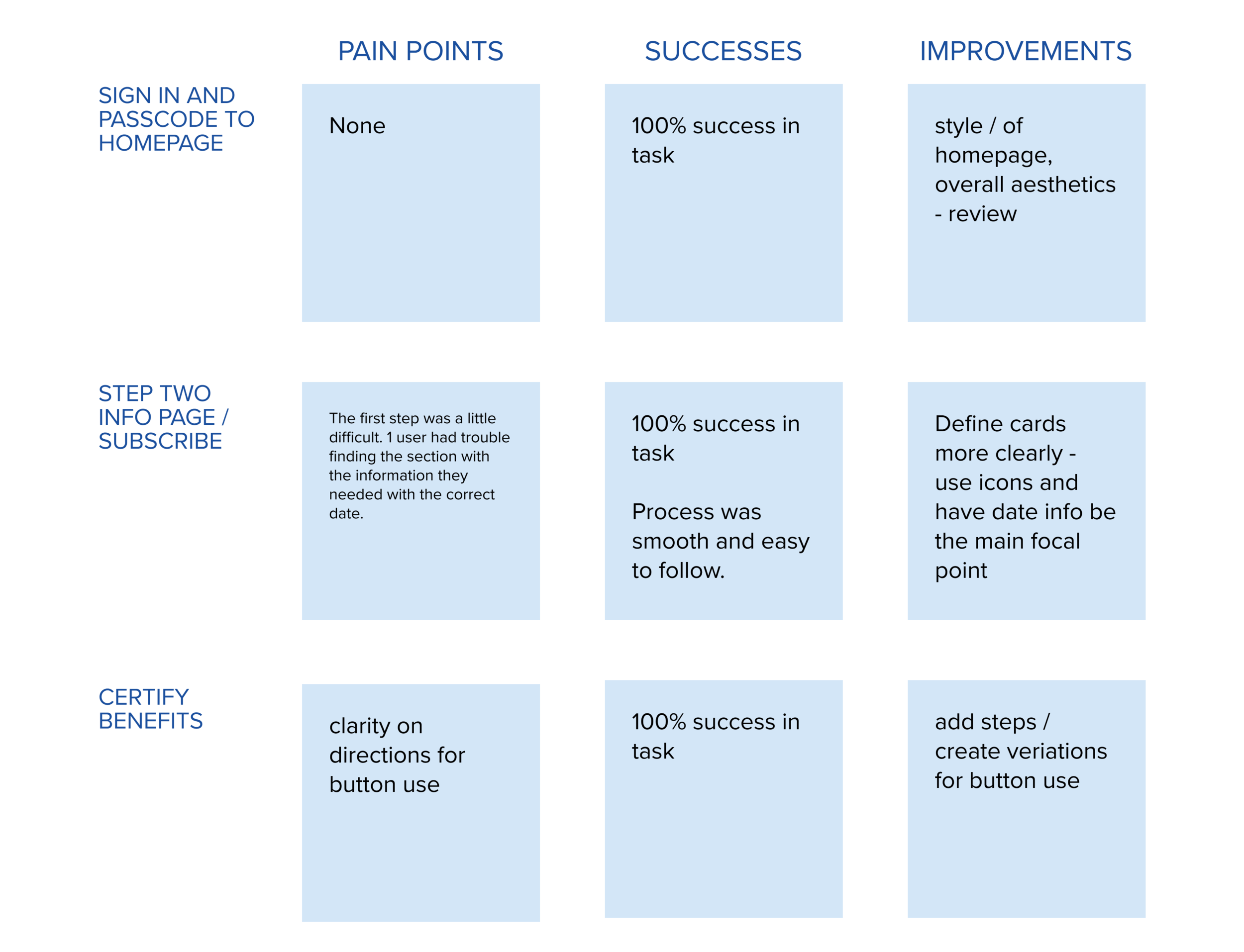
21 users were able to complete all tasks with 100% direct success rate. The steps were easy for the user and their feedback clear. UI needed to be streamlined across pages. Visual hierarchy for cards and wording for the info page could be improved.
Improvements
Info page drop down and selection updated for clarity and simplicity upon the page

Reflection
Research was key to understanding what the feature would be and how it would function for the Department of Labor. This resulted in a straight forward app for certifying benefits. The language around each step was very important for logistics and messaging to the user as well as aligning with the government messaging.
The addition of a language preference was important as well as clear steps confirming when the benefits would be dispersed once certified.
Transparency was very important to the user in this topic and developing this brightened my interest in financial technology and it’s many uses and users.
I really enjoyed developing the UI within the constraints of the brands colors and overall aesthetics while also making it feel accessible and up to date.
What’s Next?
Create pages for each menu option to explore for usability testing.
Develop a stats page for the user.
Create graphics for the benefits page.
Create more variations for buttons.