Concept, UX Research, UX/UI Design, Branding
Solo creation of an APP minimum viable product with a new concept to fund shift for individuals who wish to contribute monetarily towards local causes and organizations within their community.
The Problem
A new approach to enable monetary distribution to one’s eco-system. Making fund shifting an easy and accessible engagement for those who desire to contribute to causes they care about.
The Solution
Through conducting user interviews, competitive analysis, card sorting, I then created a task flow using hi-fi wireframes, a developed UI kit and created a prototype for the onboarding process and contribution pages. The user can then connect through their bank and cash apps, updating the % of funds they can contribute to a local organization that is committed to a cause within their ethics and interests.
Tools
Figma, Whimsical, G Suite, Optimal Workshop
Insights
People wish to contribute regularly towards causes that they are passionate about.
This topic is very much related to the importance of why the users are on on social media; they wish to know about causes around them as soon as they are in the news or of relevance. Social media keeps them feeling up to date with what is going on in their communities.
They are interested in contributing to local causes vs global causes. They feel they can make a greater impact locally with smaller repeated funds feeding into their own ecosystem.
discovery and research
Competitive Analysis

PROS
Clear onboarding process, you can skip many steps until later
Graphics for spending habits
UI elements
Able to rename expenses
Clear visual hierarchy / breakdown of banking options
QR Code
Monetary hierarchy
Visuals / Animated
Categories to explore
Onboarding process was precise, clear and easy
Main menu / navigation is clear / icons and many options for what to do with your spending
Easy to pay someone instantly
Record of your transactions
Deposit money into your linked bank account easily
CONS
Very few organizations to select from
nothing local, all large-scale
Limited membership
Uncategorized transactions accumulate easily
Once you are settled up you don't see the transaction readily, you can export a CSV sheet of everything
Unattractive UI Elements
Cost of monthly subscriptions make it less accessible
Focus is on beginner mediators vs. advanced
Paid account only
Slow moving load time for every entry
Hierarchy of navigation is unclear due to simplicity of options and minimal menu
Fee to send money via credit card and for instant cash out
No easy search options
Persona
Project Goals
information architecture
Key Features
Onboarding / Account creation
Integration with bank account / funds
Categories of important causes to contribute to
Distribution of funds
User Flow
Wireframes
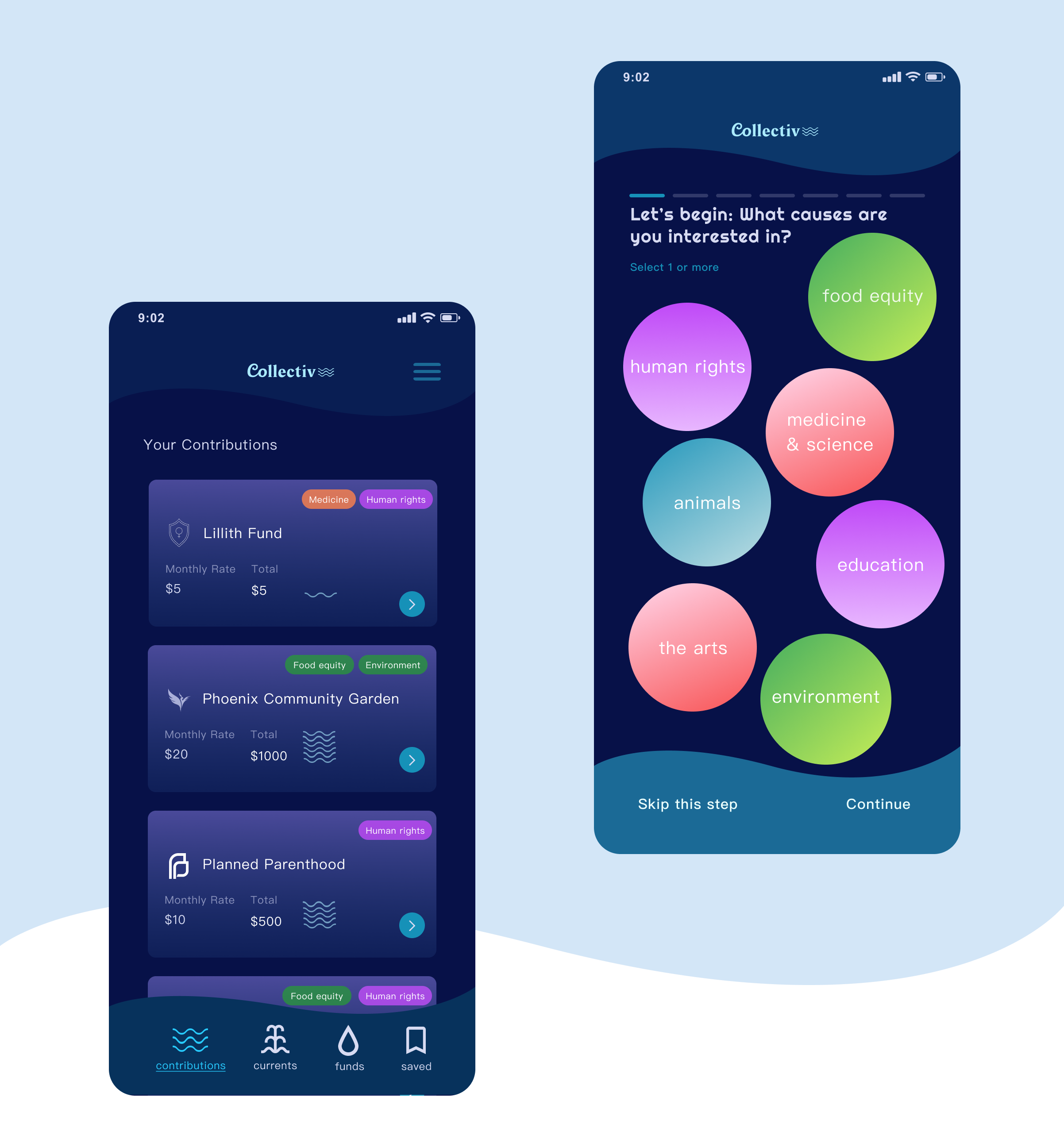
The onboarding process was most important in deciding what would then become of the categories for each individual user.
Where would they wish to redirect their funds? What would their geographic scope be? What values and ethics do they wish the organizations to run by? What organizations are related to the ones they already contribute to?
Each onboarding page presents these categorizations to then feed into an algorithm for the user’s landing page.
brand development
UI Kit
In developing a UI Kit the categories defined by the user surveys and card sorting consisted of topics of interest Human Rights, Medicine & Science, The Environment, Animals, Education, The Arts, and Food Equity.
Many of these categories intersect therefor different organizations can qualify for multiple categories within an individuals dashboard.
My approach to developing the UI was in creating a dark mode app to preserve energy while also representing the funds as a resource, as water therefore the icons were representing fountains, waves, and drops.