UX Research, UX/UI Design
An added feature to the The NY Department of labor website. Designing a responsive lite app to manage individuals weekly certification of unemployment benefits.
The Problem
To create an accessible app through NY.gov for individuals to safely and accurately certify benefits from their mobile device.
The Constraints
Sticking to one main functionality for a site that has multiple pain points.
Designing white label UI elements
Tools
Figma, Whimsical, Maze
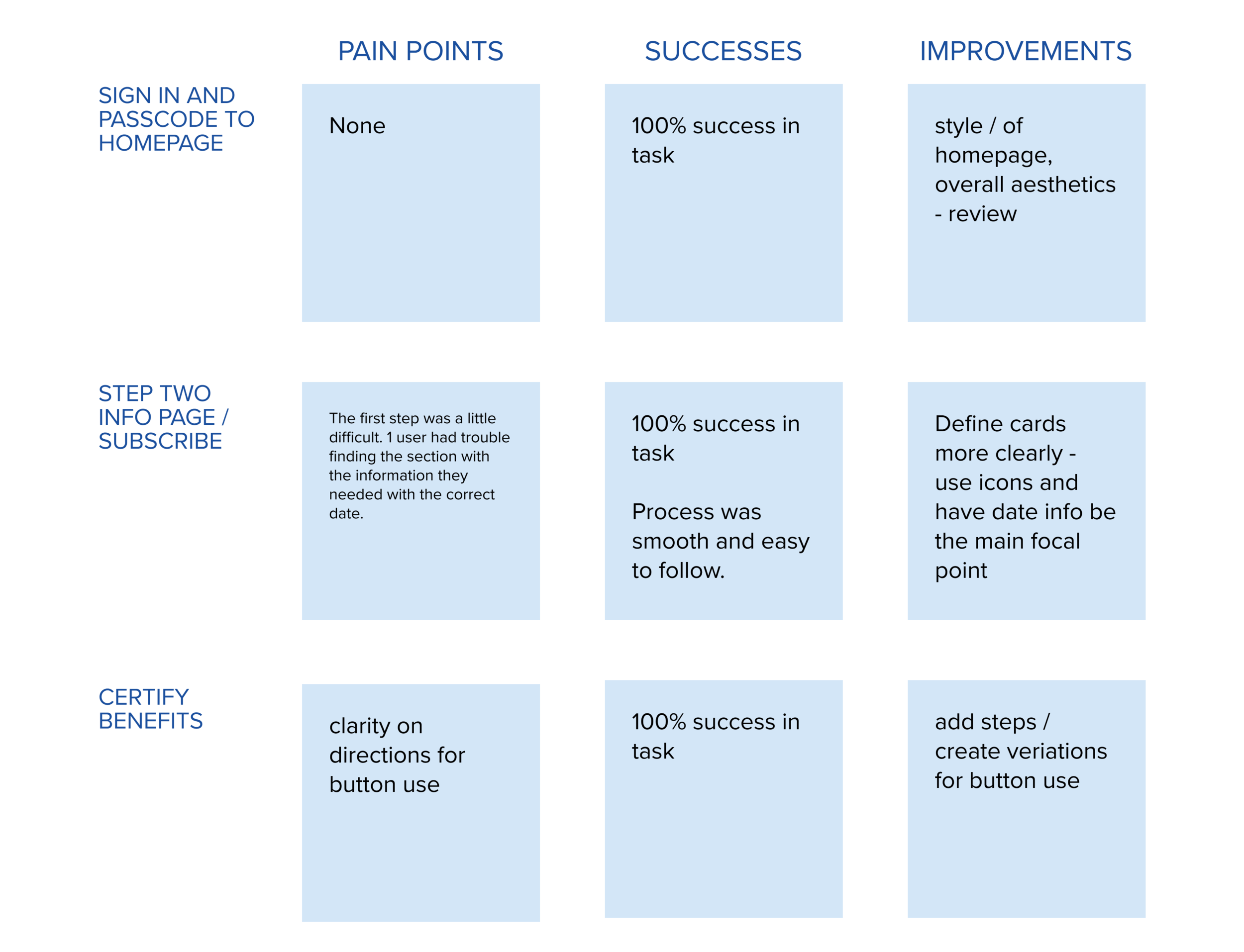
discovery and research
Competitive Analysis of 6 Government Sites
None included biometrics
3 / 6 included How to video guide
3 / 6 were responsive sites
1 / 6 offered a mobile app version
1 / 6 included a Search bar primary button
4 / 6 Language options beyond English/Spanish
Insights
Surveyed individuals who had to certify for unemployment benefits in the last two years. 100% used smartphones and 76% lost their jobs due to COVID-19.
Need for mobile accessibility
Language options on certification pages
FAQ pages
Notifications
Reminder to certify / clarity on how many certifications are left
Clearer Information hierarchy
Upgrade aesthetic
Legible fonts
Simplicity of language used for information
A better FAQ section that covered the differences between regular unemployment and the PUA unemployment
A clearer “finishing page”
Persona

information architecture
Key Features
UI to include accessible buttons and icons
Certification of benefits confirmation
Passcode sign in - lite app
Graphic representation of how many benefits have been claimed and remain
User Flow
Brand development
Using the original colors and font from on the NY.gov site I expanded upon the range of color ways. I also developed buttons and accessible icons for the lite APP.